Group 2 Website Analysis and Design
Analysis of Website Requirements
Criteria to be Analyzed (Zac)
- Target Audience
- Customer Requirements
- Site Purpose
- Site Appearance
- Site Content
- Site Features
- Site Functionality
- Performance
- Maintenance
- Accessibility
- Consistency
- Throroughness
- Professionalism
- Organization
Analysis Methods (Vickie)
-
Target audience could be analyzed using the following techniques:
-
From the current content of the CIS site, deduce who could be using it now.
-
Talk to current CIS instructors to find out who they would like to have using the site
-
Acquire usage logs from the Kishwaukee College webmaster and see how many users are on Kishwaukee machines, how many are from outside the college, how many are instructors, etc.
-
When users enter the site, pop up a brief (one or two question) survey requesting demographic information (type of user, reason for access).
-
Customer requirements in general could be analyzed using the following techniques (many specific areas of customer requirements also appear below):
-
Survey key stakeholders (CIS instructors, current CIS students).
-
Deduce previous requirements from the current CIS website.
-
Site purpose requirements could be analyzed using the following techniques:
-
Talk to current CIS instructors to find out their opinion of the site's purpose.
-
Compare the stated or implied purpose of similar sites.
-
Site appearance requirements could be analyzed using the following techniques:
-
Talk to the Kishwaukee College webmaster and get a copy of the style standards for the college website.
-
Ask Dave how much of the Kishwaukee standard he expects us to conform to.
-
Site content requirements could be analyzed using the following techniques:
-
Check the content on the current website.
-
Talk to the CIS instructors about additional content. Also check on content that may no longer be needed.
-
Site functionality requirements could be analyzed using the following techniques:
-
Review project requirements and find required functionality for the final check-in.
-
Assess functionality of current website.
-
Performance requirements could be analyzed using the following techniques:
-
Check industry research for acceptable response times.
-
Check loading times over dialup connections.
-
Maintenance requirements can be analyzed using the following techniques:
-
For a style change (font, color), how many separate places have to be changed in the website to maintain a consistent look and feel? How hard is it to keep the site consistent?
-
How difficult is it to keep links up-to-date?
-
Accessibility requirements can be analyzed using the following techniques:
-
Apply the accessibility criteria from the Web Accessibility Initiative (http://www.w3.org/WAI/)
-
Use a free accessibility analyzer on the Internet to check the site as it is developed.
-
Consistency can be analyzed using the following techniques:
-
Ask current users of the CIS website what items are most helpful to keep the same from one page to the next.
-
Decide what the key items are to keep the same from one page to the next, and count how many are in fact the same across the website.
-
Thoroughness can be analyzed using the following techniques:
-
When users are leaving the CIS website, pop up a brief survey asking, "Did you find the information you needed?" and "If not, what were you looking for?"
-
For information duplicated on the CIS website that is available elsewhere on the Kishwaukee site,
audit to make sure it is correct. (Note that duplicating information, in general, is a bad idea
since it leads to inconsistencies.)
-
Professionalism can be analyzed using the following techniques:
-
Count the number of typos and grammatical errors occurring in the website content.
-
Check web pages in the site against TidyGUI or a similar tool and see how many XHTML errors are detected.
-
Check site for dead links.
-
Compare "look and feel" of the site against other sites developed by professional web developers for similar purposes.
-
Organization can be analyzed using the following techniques:
-
Give trial users a sample piece of information to find, and see how many clicks it takes them to find it.
-
Have some trial users talk through a search of the site, so we know the thought process that led them to take a particular path. Assess our organization against what the users expect.
Objectives and Goals (Nick)
-
Completely revamp the entire CIS website
-
Provide all the old information in a better and easier to use format including:
- The CIS programs
- All the courses
- Faculty
- Advisory Committee
- Class schedules
- Class status
-
Add new links/features such as:
- Advertise important CIS news on the homepage
- Section for departmental planning materials for teachers
- Section for student advisement materials that teachers and students could use
- Section to post a generic syllabus for each course (so students know what they’re getting into before they start)
- Section for the advisory committee to get info
- Proposals for next meeting
- Comment areas
- (We only need to make the sections, the info would be posted by Dave)
- We need a better contact form for the students
-
Make navigation easier by:
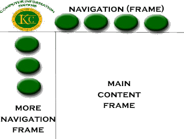
- Using frames to keep the same navigation bar in all pages
- Keep all the site's links in the navigation bar
- Fixing some of the current navigation problems (such as broken, misspelled, and wrong links)
-
Stay somewhat consistent with the Kishwaukee main site
-
Make the site quick-loading and easy to use:
- Very few graphics (maybe one on the home page, like they have now)
- Use frames for the navigation bar and title so they don't have to reload on each page
-
Must be very compatible with all browsers
-
Must be accessible for anyone (the visually impaired, those with mobility difficulties,
people with old versions of browsers, etc.)
-
Must have all functional requirements (CGI for forms, etc.)
-
Must conform to Dave's website standards
Audience Definition (Shelley)
- Current Students
- Prospective Students
- Prospective Instructors
- General Community
Usage Scenarios (Shelley)
- Current Students would be looking for:
- Faculty Information/Sites
- Class Information/Times
- Computer Science Department
- Prospective Students would be looking for:
- Class Information/Times
- Department Information(classes offered)
- Degrees offered/Applicable
- Prospective Instructors would be looking for:
- Department Information (department contacts - Kishwaukee doesn't have official department heads)
- Class Information (Classes offered)
- Faculty (who they'd be working with)
- General Community would be looking for:
- How their tax dollars were being spent
- Current Events
Competitive Analysis (Shelley)
Schools visited were:
- Northern Illinois University
- Waubonsee Community College
- University of Iowa in Iowa City
- Parkland Community College
- Sauk Valley Community College
- Joliet Junior College
- College of DuPage
- Rock Valley College
Things in common across competitive websites:
A lot of the colleges had links to the computer science-related degrees available, as well as course offerings. All of them had links to the college's home page from the computer home page, but a few just dropped them as you went further into the site.
The easier sites to work with had a navigation bar across the top and along the left side.
Items missing from the current CIS website:
DuPage had a horizontal navigation bar that served the college, and a vertical navigation bar that served the department.
Rock Valley College made simplicity the top priority, with only four items in the navigation bar, one image in the background, and division supervisor information only. Very simple.
Standouts:
- Waubonsee Community College lacked a CIS site all together. You had to find instructors' personal web pages to get information.
- Sauk Valley had a horrible download time over a dialup connection because it had over fifty graphics to download on the home page, but virtually nothing on their CIS page.
They also just lump all the information they have into one area in the middle of the page, which is convenient, but very unappealing to the eye.
- Joliet's banner was only compatible with a 600 by 800 resolution monitor, but their information resized to fit the entire page, which just looked bad.
- A downfall of DuPage's site was there were no links back to the previous page/area, and you had to use the back button every time.
- Rock Valley was simple, but it seemed to take a thousand clicks to get anywhere.
Site Content (Amy)
-
Introduction to the CIS website and what it has to offer
-
Advertise CIS news
-
CIS Program requirements
-
CIS courses
-
Generic syllabus for potential students
-
CIS faculty information
-
CIS advisors
-
Advisory Committe info
-
Materials and information helpful to faculty and students
-
Contact CIS
-
Class schedules (linked to main Kish website)
-
Class status (linked to main Kish website)
Content Grouping and Labeling (Amy)
-
Introduction
- Explains what CIS is, and what it has to offer
- A brief overview of the program
-
Advertisting CIS News
-
CIS Program
- List of program certificates
- Requirements for each certificate
-
CIS Courses
- List of courses offered
- The credit hours for each course
- Prerequisites for courses
- Brief explanation of each course
-
Generic Syllabus
- To give students an idea what a course would be like before enrollment
-
CIS Faculty
- List of the full-time, part-time, and assisting instructors
- What each instructor teaches
- Contact information for each instructor
-
CIS Advisory Committee
- List of the committee members
- Information for the Advisory Committee (current and previous business, course proposals, etc.)
-
Departmental Planning
- Syllabus guidelines and requirements
- Requirements for curriculum changes
- Procedures for creating a new course
- New course rationale questions
-
Student Advisement Material
- Planner for 2 year degree
- Planner for Computer Programming Certificate
- Planner for Microcomputer Applications Certificate
- Planner for Data Communications and Networking Certificate
- Planner for Webmaster/Web Administration Certificate
- Planner for Webmaster/Web Development Certificate
- Advisor's Comment Card
-
Contact CIS
- A better contact form for students
-
Class Schedules
- Linked to Kish's main website
-
Class Status
- Linked to Kish's main website
Functional Requirements (Zac, Nick)
Site Purpose
- The site's content should clearly reflect its purpose.
- The site should be primarily informational.
Site Appearance
- The site should not be cluttered with graphics, and should be easy to read.
- The color scheme should result in text being in clear contrast to background.
- Appearance (look and feel) should be appropriate to the target audience.
- The site should remain consistent throughout.
Site Content
- Content must be informational, direct, and to the point.
- The site must have a professional look and feel.
- Graphics shall be limited.
Site Features
- Each page should have a Navigation bar that provides easy naviagation through the system.
- Navigation through the site should be clear, and the user should be able to locate the
information he/she needs with ease.
- The site should load quickly, even over a 28.8K dialup connection.
- Any "uncommon" features should be explained thoroughly.
- There should be enough information to make the visit to the site worthwhile.
- Navigation should be consistent throughout the site.
- Site appearance should be consistent throughout, and should also be consistent
with the main Kishwaukee College site.
- The site will include a link to the existing CIS site for continuity.
Site Functionality
- New windows should open for some of the information. (More details will be added for subsequent check-ins.)
Maintenance
- The site should use modern, portable and compatible coding so it can be
used as long as possible.
- The site should be designed so that it can be changed/updated easily and
conveniently.
Accessibility
- The site should be listed in search engines, and easily located by
potential users.
- Internally, users should be able to locate parts of the site
easily (good navigation, explanation)
- The site should be in compliance with ADA (Americans with
Disabilities Act), Bobby certified, and be courteous to those with disabilities.
Consistency
- The site must be consistent with the main Kishwaukee website (to the extent required by instructor).
Thoroughness
- The site should have no typos, dead links, or CSS, HTML, or JavaScript errors.
- All content must be available (no "under construction" pages)
- All forms have corresponding CGI scripts to function
- Linked CSS must have the corresponding CSS file to function
- Any other objects (applets, Flash SWF’s, graphics, etc.) must have corresponding files to function
- All linked files must be in the correct folders to function
Professionalism
- The site must look professional.
- We also want to let the users know that the CIS site was created by students.
This will demonstrate the hands-on experience that students gain
from the CIS department at Kishwaukee College.
Organization
- The site must be well organized and easily navigated.
- Content needs to be correctly grouped together and labeled.
Website Design
Site Structure Listing (Nick)
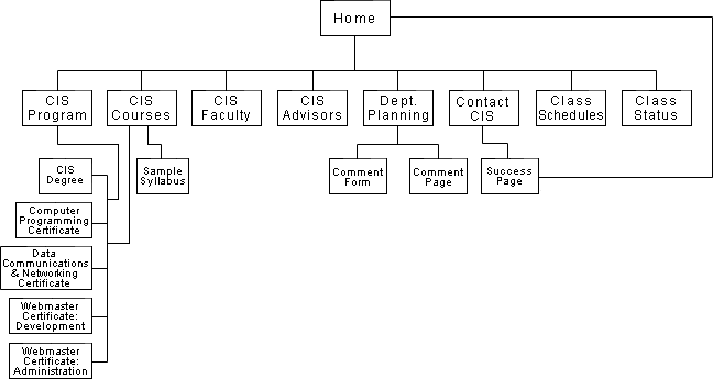
Home
- Link to Kish Home
- CIS Program
- Computer Information Systems Degree
- Computer Programming Certificate
- Microcomputer Applications Certificate
- Data Communications and Networking Certificate
- Webmaster Certificate – Administration
- Webmaster Certificate – Development
- CIS Courses
- CIS Faculty
- Links to Faculty Information
- CIS Advisors
- Departmental Planning
- Comment form
- Comment page
- Contact CIS
- Class Schedules
- Class Status
Architectural Blueprints (Amy)

Global and Local Navigation Systems (Erin)
Global
- Kishwaukee College home page
- CIS Program
- CIS Courses
- CIS Faculty
- CIS Advisors
- Departmental Planning
- Class Schedules
- Class Status
- Contact CIS
Local
Every link listed will have a back button.
- From CIS Program (all links listed in CIS Programs will be linked to CIS courses):
- Computer Information Systems
- Computer Programming Certificate
- Microcomputer Applications Certificate
- Data Communications and Networking Certificate
- Webmaster Certificate - Administration
- Webmaster Certificate - Development
- From CIS Courses:
- From CIS Faculty:
- Links to Faculty Information
- From Department:
- Comment form
- Comment page
- From Contact CIS:
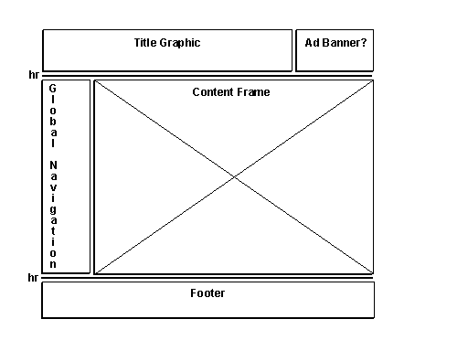
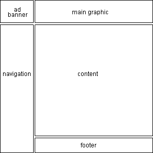
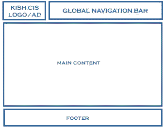
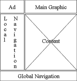
Layout Grids (Nick, Zac, Amy, Vickie)
Design Sketches (Erin, Zac)
New CIS Logo #1 - Zac/Erin
New CIS Logo #2 - Nick

Page Mock-Ups (Amy, Shelley, Zac, Nick)
Mock-up #1 - Zac

Prototype of layout #1
Mock-up #2 - Nick

Mock-up #3 - Zac

Prototype of layout #3
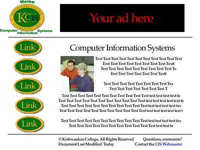
Mock-up #4 - Amy

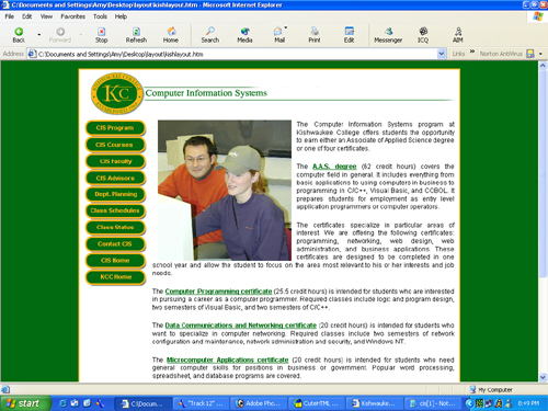
Prototype of layout #4
Note: Layout #4 has been selected as the style for the final version of the website.
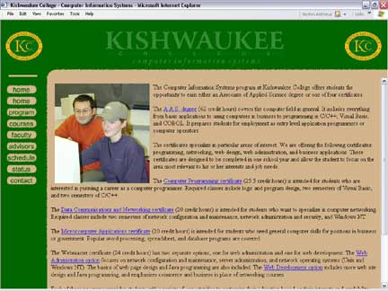
Mock-up #5 - Amy

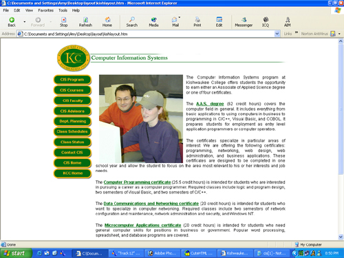
Prototype of layout #5
